Kateryna Shevchenko - A Typography Projection Mapping Installation

Ever wondered how a frequently used phrase could be turned into an interactive installation?
Graphic and Motion Designer, Kateryna Shevchenko, prompted by her Degree theme 'Material Type: Physical Language', picked a phrase related to design to create a physical outcome, which would enhance the viewer's understanding of the message.
The typography installation is a representation of Neville Brody’s words 'Digital design is like a painting, except the paint never dries'. Since the quote means that digitally generated design is changeable, the aim was to create something that could be constantly changed by the people who use it.
Another aim was to motivate the audience to start creating their own outcomes, which was how the idea of creating an interactive typography installation was born.
The initial plan was to make all of the triangles interactive, so they light up when touched. However, due to lack of time and budget, Kateryna reduced the interactive elements to 12, instead of 336. The later would require a fully interactive grid and use only the words from the original quote.
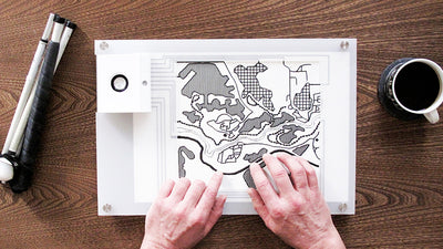
Since the typography piece was meant to create as many variations of type as possible, the designer experimented with various geometrical shapes (squares, circles, rhombus, etc.).
By giving those shapes to different people, she could analyse which one worked better in terms of quantity and legibility of the letterforms. The best examples outcomes were made with squares and triangles (squares cut in half) and that influenced the look of the grid for the final work.
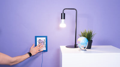
Kateryna was looking for the right tool to turn her project into an interactive installation. She explored using LEDs, but in the end decided to use projection mapping with the Touch Board, which had all the features she needed.
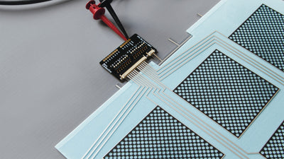
At the same time, she was deciding between conductive inks and push buttons. The buttons were easy and much easier to understand, while inks helped to achieve the tactile connection between visitors and her installation piece. Many people also did not expect the paint to conduct electricity, so it was a complete surprise when something appeared as a result of a touch.
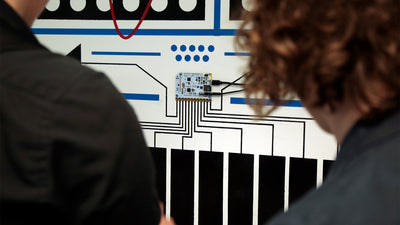
The first step was to test the Electric Paint and see how it would work, in terms of the signal and electricity circuit. Although it went well while testing on paper, further experiments showed that not all the surfaces would react the same, and therefore the final decision was to use plywood. The buttons were painted onto the plate using screen-printing, and were then connected to the Touch Board via copper wire cables.
The plates for the typography projection were laser cut separately, as they had to be removable to switch on/off the board inside. In addition, it made the installation process much easier, as it could be hung between two rails.
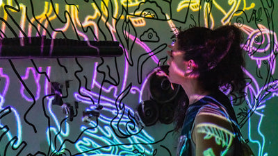
She used MadMapper to align the projections with the grid and to make a projector respond to the buttons. Therefore, each electrode (connected to one of the buttons) on the Touch Board was programmed to play a specific video or image.
The outcome and alignment were so well made, people thought the piece used LED lights, not the projector, to create the interaction.
Images & Video: Kateryna Shevchenko
We love it when you share your projects! Post your project on Instagram, YouTube, or Twitter, and make sure to tag @bareconductive or use #bareconductive. You can also send your videos and photos to info@bareconductive.com so we can post them on our site for the world to see.